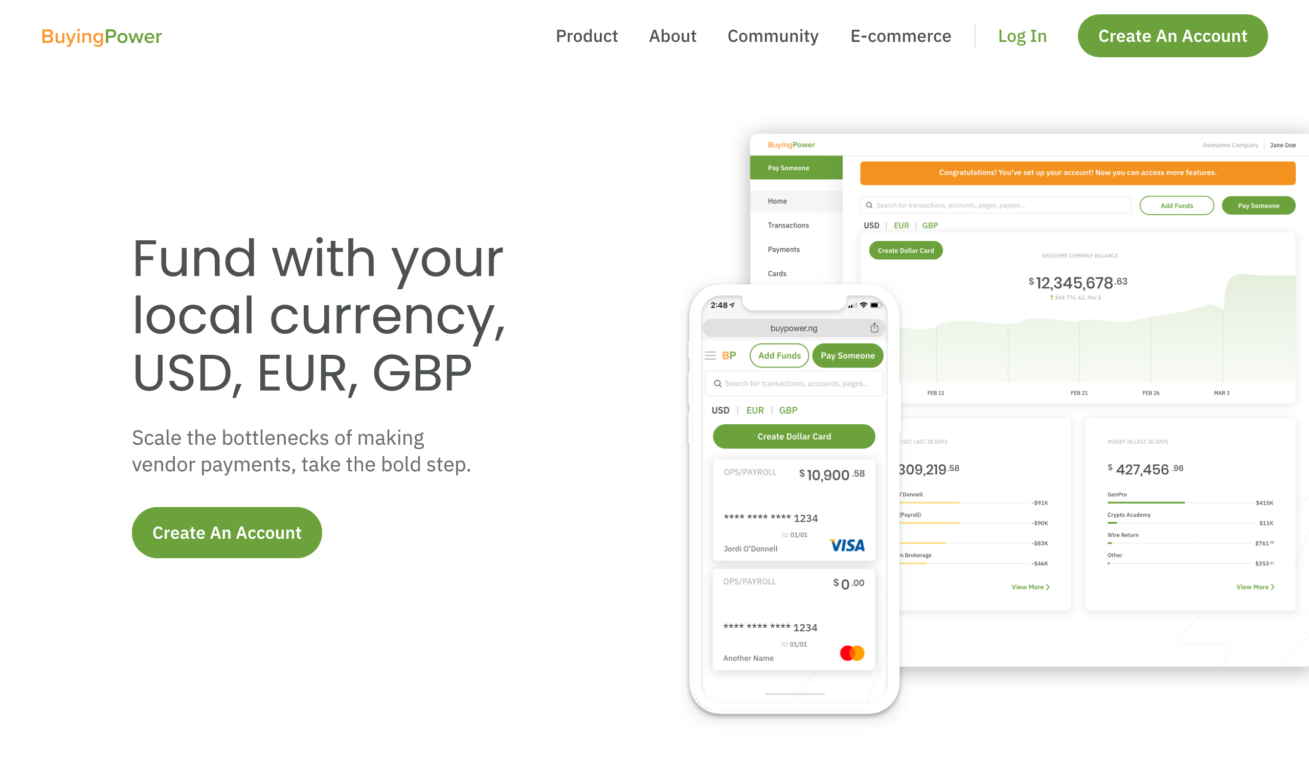
My friends at BuyingPower challenged me to take a complex and overwhelming international business payments system, with its wide variety of payment types and currencies, and make it look as friendly and as easy to navigate as a children’s book. To achieve this simplicity, I stripped the content down to its basics and broke complex tasks, like sending payments and managing accounts, into multiple steps.
The initial load view of the BuyingPower Home Screen.A signed in user experiences a simple five-step flow to send payments to employees and vendors. In this example, the user has entered an amount they would like to pay and has selected USD as the currency to pay in.The user can select from a list of contacts they’ve imported or manually entered, or add a new payee during the payment process.BuyingPower offers a variety of payment options, each of which impacts the payment flow. By displaying the payment options as selection buttons with information on fees and timing, we answer questions the user often has at this stage so they don’t have to navigate away or click on anything to get the information they need.Because users are sending funds, especially because they’re sending significant amounts, screens that draw their focus onto the accounts they are drawing from, and allow them to change these sources, are incredibly important. This is why account details get their own step in the process.It’s important to review a transaction before initiating it. I wanted the review screen to clean and easy to scan.A simple success screen that makes it easy for the user to take the actions they are most likely to take after making a payment.